

Google has for some time been testing several new designs for its search results on desktop users. Today’s article includes clear visual examples of these tests, information about why Google is running them, and which version we at Brath prefer.
Some of you may already have noticed this, but right now Google is running an extensive test of the design of its desktop search results.
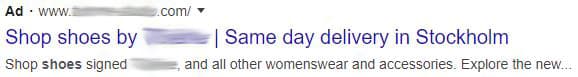
Different types of results are shown to different users, something that’s easy to check if you work in an office with many computers. For example, try searching for “shoes” on Google and then compare the results page from one computer to another.
Google is experimenting with things like the appearance of ad labels and whether or not favicons should be included, just to mention a few of the most important elements.
Below are a few visual examples of different variations you might encounter:
- Ad label with frame and green highlight
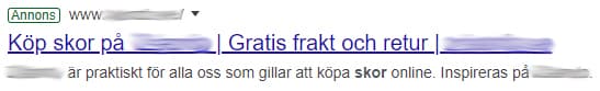
- Ad label with black highlight
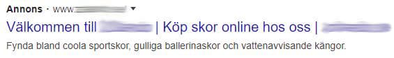
- Organic listing with favicon
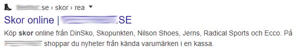
- Organic listing without favicon
And more…
Why is Google running this test?
As always, Google communicates that tests like these are conducted in order to ultimately provide the best possible user experience. In this case, however, it seems more likely that it’s about what generates the most revenue – that is, the highest number of ad clicks.
The latter has sparked frustration among several well-known names in the SEO community (ourselves included), since more ad clicks inevitably mean fewer clicks on organic listings.
It’s also worth noting that the issue is even more pronounced in English search results, as it is usually harder to distinguish between an ad and an organic result.
The reason is that ads are labeled with “Ad” and not “Annons”, which in many cases makes the label look too similar to a favicon.
Which design do we at Brath prefer?
Of the different SERP variations we’ve seen so far, the combination of framed and green-highlighted ads together with favicons for organic listings is the one we prefer the most.
In our view, this version creates a clear distinction between paid and organic results (which is the most important factor), while favicons add a nicer aesthetic. Favicons also give webmasters an additional tool to influence CTR (click-through rate) as well as brand recognition.
(Note: This only applies to language settings where the ad labels in the search results are written with more than two letters (for example, “Annons” instead of just “Ad”). Otherwise, the option that likely creates the least confusion is for Google to remove favicons altogether.)
